I was going to title it as 'ClearType sucks' but anyway.
ClearType uses a technique named subpixel rendering that absolutely sucks - at least for me. Say for example I have some black text on white background then the subpixel rendering will make some adjacent pixels have some colors.
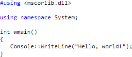
Take an example, Consolas, a font that works only with ClearType:

That just looks painful for my eyes, I see every colored pixel in something that should had been only black and white (or gray at least) - it's just friggin painful. If you don't notice it (well, I might see better than you) look here:
And I'm not just running on crap hardware - I think a Dell 2407WPF-HC is good enough!
I've also tried to tune the ClearType a bit and it still looks like crap.